u3a styleguide
Last updated:
Styles for APT to use when designing content for u3a
Branding
Logos
Presented here unmodified, the white logo is only suitable for a u3a dark background color
Presented here without forced spacing
Local logos may alternatively be used in place of national logo
u3a Colors
Main Colors
- Primary: u3a Yellow
- ■ #ffc700
- Secondary: u3a Dark
- ■ #005ab8
- Tertiary: u3a Light
- ■ #2886e6
Supporting Colors
- u3a Orange:
- ■ #ffaa31
- u3a Light Green:
- ■ #63c369
- u3a Forest Green:
- ■ #10695a
- u3a Purple:
- ■ #b49fdc
- u3a Red:
- ■ #ee695a
Grays
- White:
- ■ #fff
- Dark Gray:
- ■ #333333
- Dark:
- ■ #1a1a1a
Variations
- Lighter Blue:
- ■ #EBF0F9
Acceptable color matrix
Colors provided by the u3a brand guidelines are often not suited for web usage, this matrix shows which combinations are contrasting enough to match web accessibility guidelines
| u3a Yellow ■ | u3a Dark ■ | u3a Light ■ | u3a Orange ■ | u3a Light Green ■ | u3a Forest Green ■ | u3a Purple ■ | u3a Red ■ | White ■ | Dark Gray ■ | Dark ■ | Lighter Blue ■ | |
| u3a Yellow ■ | Large only | Large only | Pass | Pass | ||||||||
| u3a Dark ■ | Large only | Large only | Large only | Pass | Pass | |||||||
| u3a Light ■ | Large only | Large only | Pass | Large only | ||||||||
| u3a Orange ■ | Large only | Large only | Pass | Pass | ||||||||
| u3a Light Green ■ | Large only | Pass | Pass | |||||||||
| u3a Forest Green ■ | Large only | Large only | Pass | Pass | ||||||||
| u3a Purple ■ | Pass | Pass | ||||||||||
| u3a Red ■ | Large only | Large only | Pass | |||||||||
| White ■ | Pass | Large only | Pass | Large only | Pass | Pass | ||||||
| Dark Gray ■ | Pass | Large only | Pass | Pass | Pass | Large only | Pass | Pass | ||||
| Dark ■ | Pass | Pass | Pass | Pass | Pass | Pass | Pass | Pass | ||||
| Lighter Blue ■ | Pass | Large only | Pass | Pass | Pass |
Text
Font
Font stack:
- Header and Body:
- 'DM Sans', sans-serif
- Icons:
- Fontawesome 4
Text types
Navbars:
- Main Header:
- Sub Header / Breadcrumbs:
Inline:
- Heading:
-
Top Level Heading: 3rem
-
Second Level Heading: 2rem
-
Third Level Heading: 1.75rem
-
Fourth Level Heading: 1.5rem
-
Headings must be used in rank order
- Text Styles:
-
Paragraph "Make the most of life once you're no longer in full time work by exploring new ideas, skills and interests with your local u3a" 1rem
Link - Alerts:
-
A simple success alert!A simple danger alert!A simple warning alert!A simple info alert!
- Form Label:
- Form Helper text:
-
You username is the same as your email address.
- Lists:
-
- Unordered list item 1
- Unordered list item 2
-
- Ordered list item 1
- Ordered list item 2
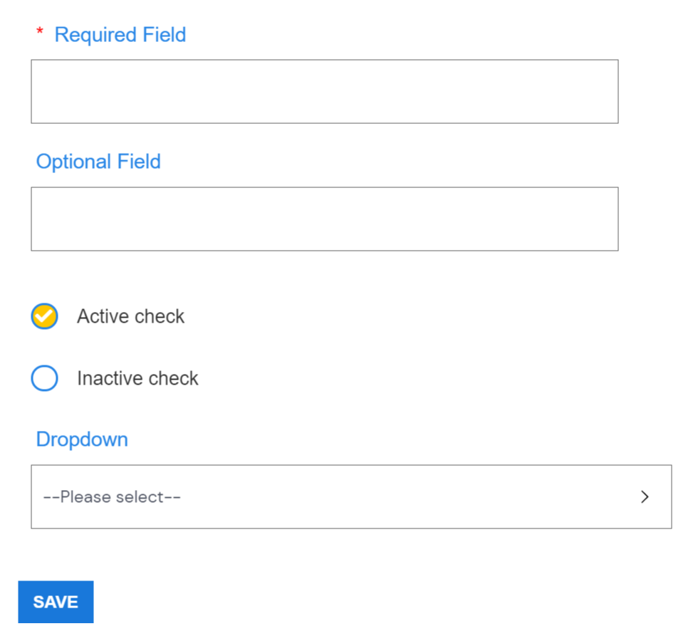
Form Elements
Web Elements
Fragments elements
Form Fields
Accessibility
The whole styleguide is written and coded to be accessible (except where demonstrating what fails accessibility guidance). This section simply provides notes about requirements and links to external resources on accessibility.
Requirements
- Focus indicator
- The CSS for any u3a product must include a line ensuring focus is indicated by a black outline or box shadow.
- Skip Nav
- Each page must have the Skip navigation link included as the first piece of HTML content, including a working link to the main content and the supporting javascript
- Targets
- Clickable targets must be at least 44 pixels in width and height unless used inline
- Menu options that are less than 44 pixels in width and height should include alternative routes that meet the target size criteria
- Page Titles
- All pages need a relevant page title
- Headings
- Headings should be used in rank order at all times
- Forms
- Form helper text needs to be actually helpful, not just a repetition of the field title
- Tables
- The first data cell of each row needs a scope attribute of “row”. This allows screen readers to specifically announce a cell
- Tables should be striped & hover indicated to improve usability
Terminology
Terminology reference on ConfluenceAccessibility Guidelines
WCAG 2.1 to AA standardButtons
Web Buttons
- Buttons should be Sentence case
- btn-secondary is the main button style to be used for navigation
- btn-primary is to be used to indicate active areas, or for on page actions such as 'Add another'
- btn-white is to be used for inactive buttons such as 'Previous' on the first page and 'Next' on the last page
Web Tabs
Fragment Tabs
Fragments Tab navigation

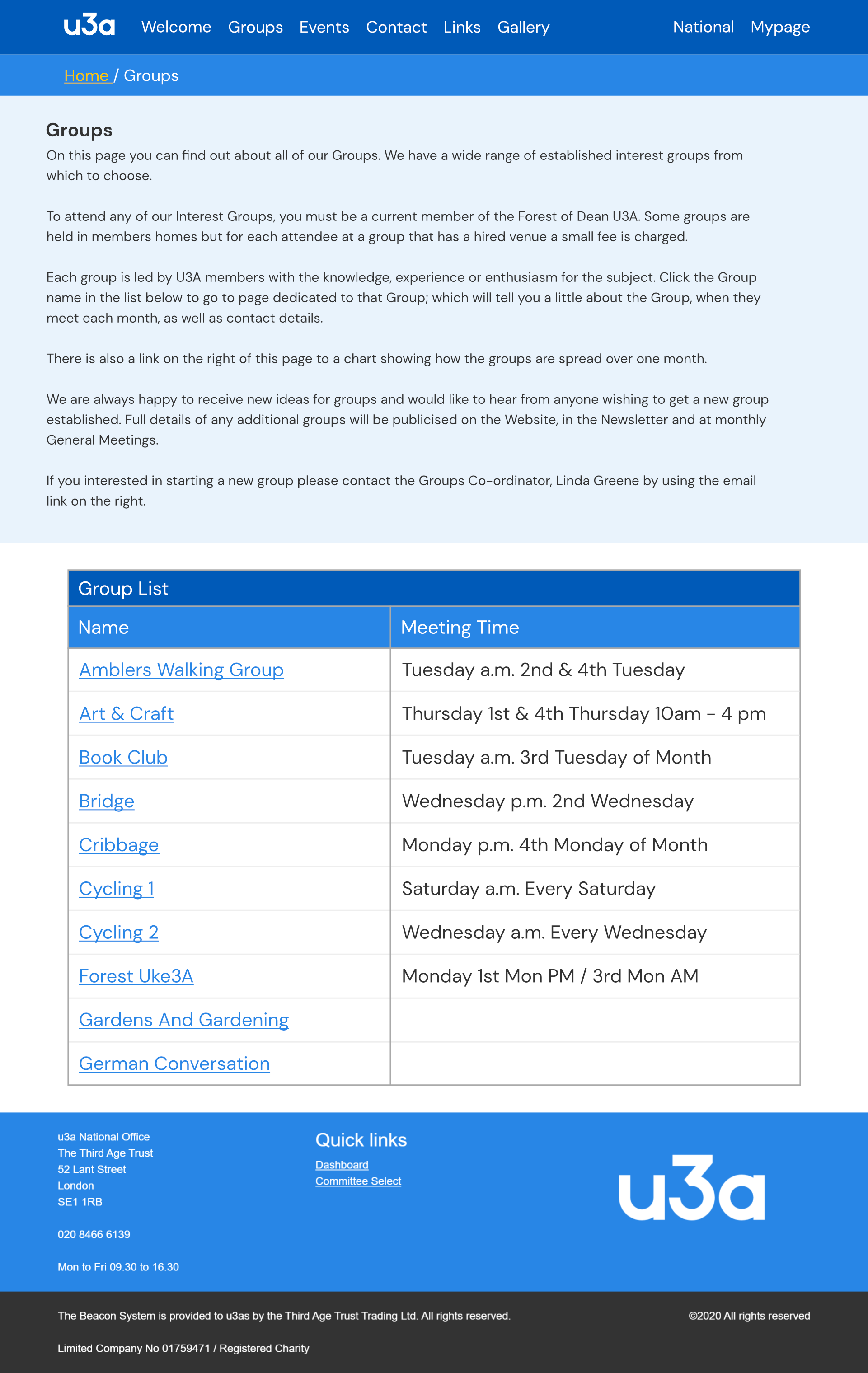
Table
Groups table
Example of a web table with a heading
| Name | Meeting Time |
|---|---|
| Amblers Walking Group | Tuesday a.m. 2nd & 4th Tuesday |
| Art & Craft | Thursday 1st & 4th Thursday 10am - 4 pm |
| Book Club | Tuesday a.m. 3rd Tuesday of Month |
| Bridge | Wednesday p.m. 2nd Wednesday |
Fragments (Image Examples)
Fragments Wireframe ExamplesTable with collapsed details
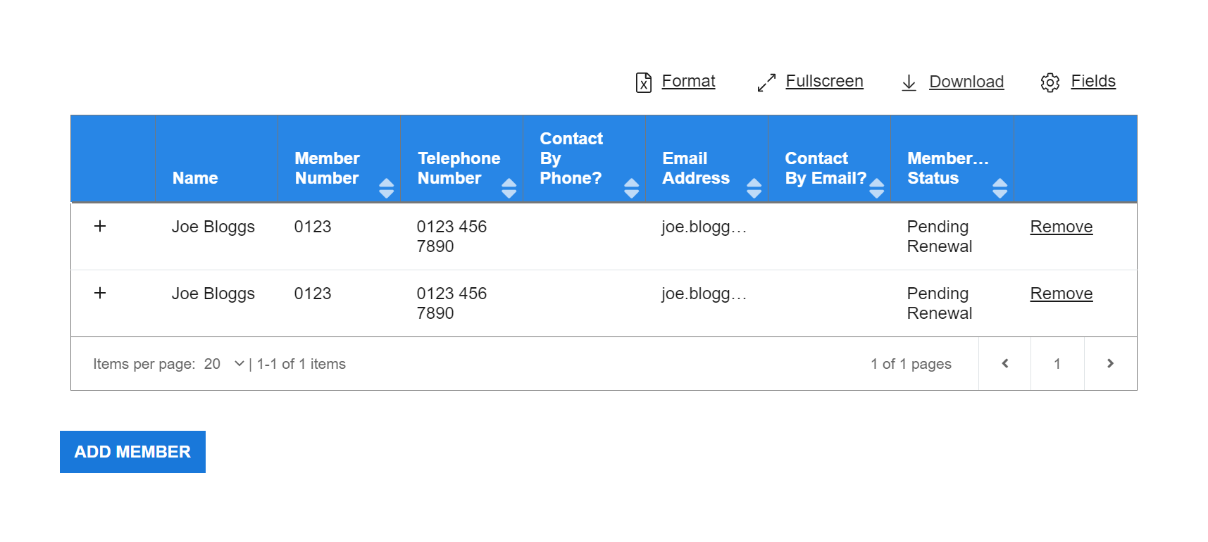
Table with expanded details
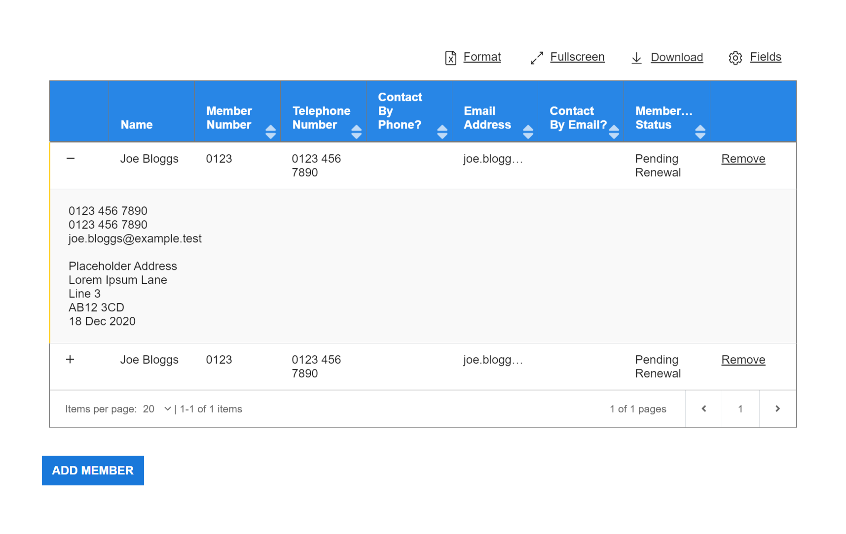
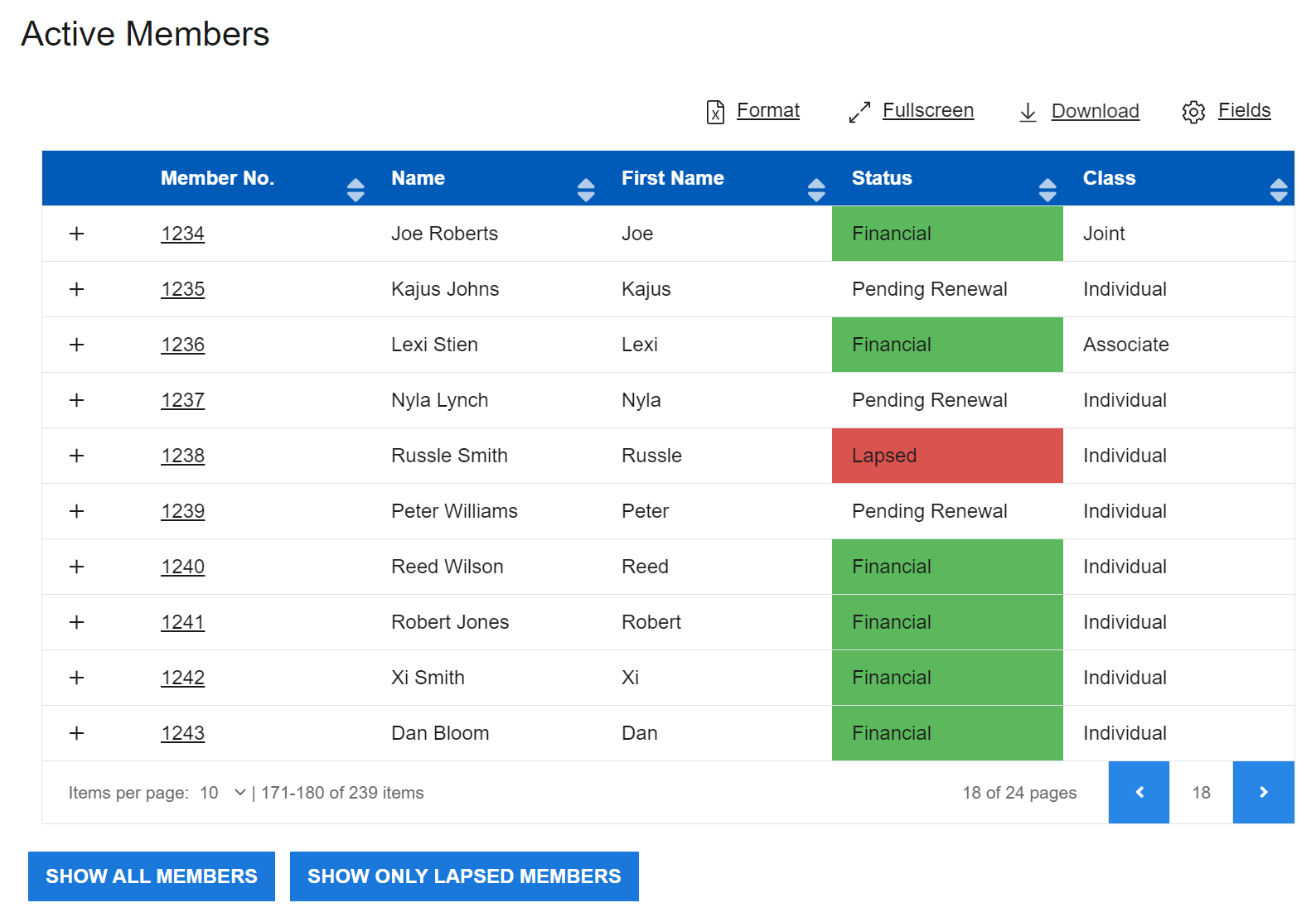
Table with status indicator
Examples
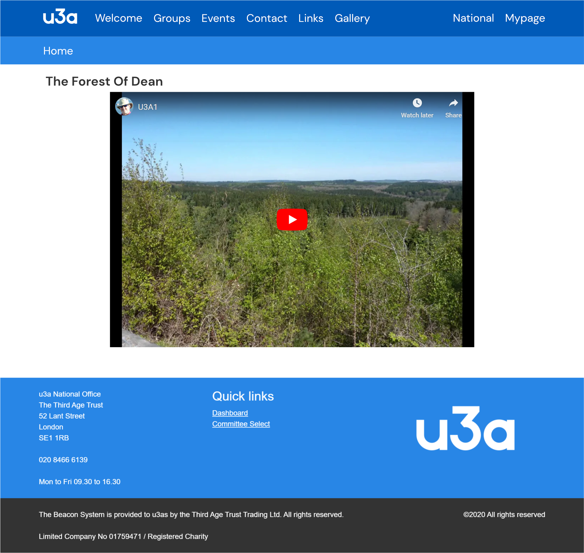
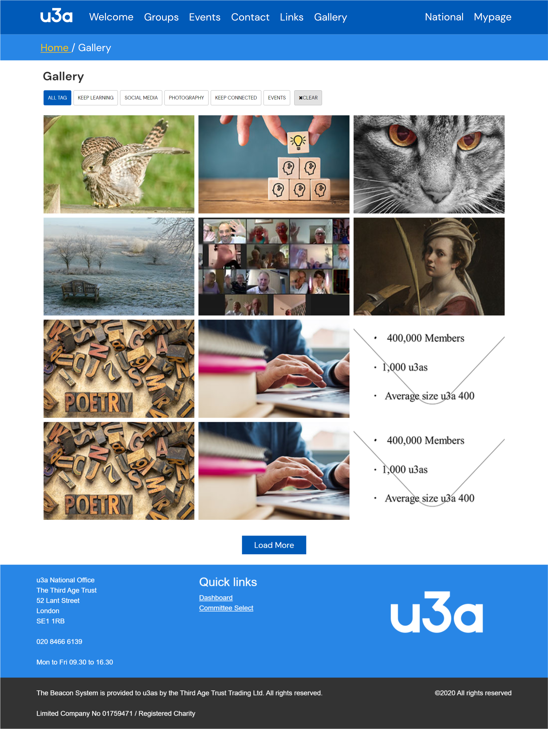
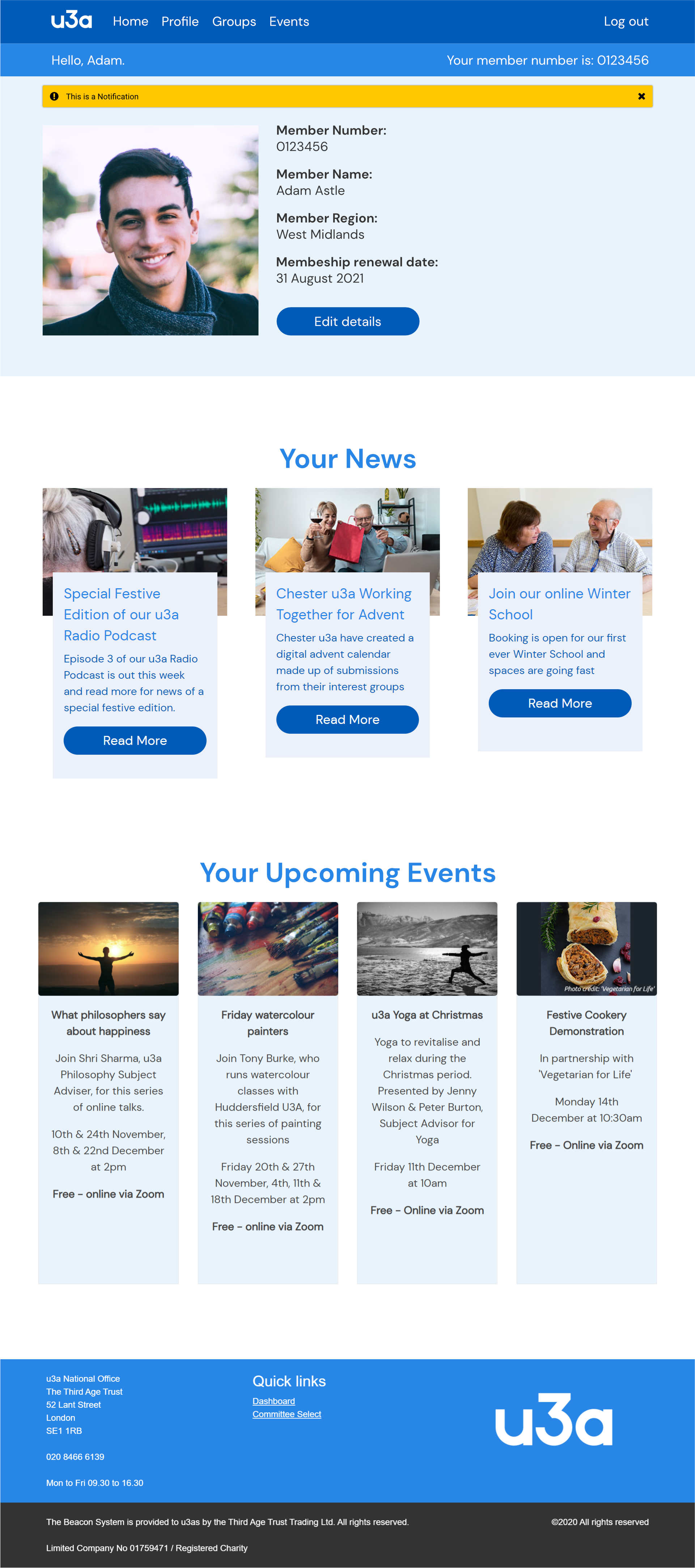
Image Examples
Microsite
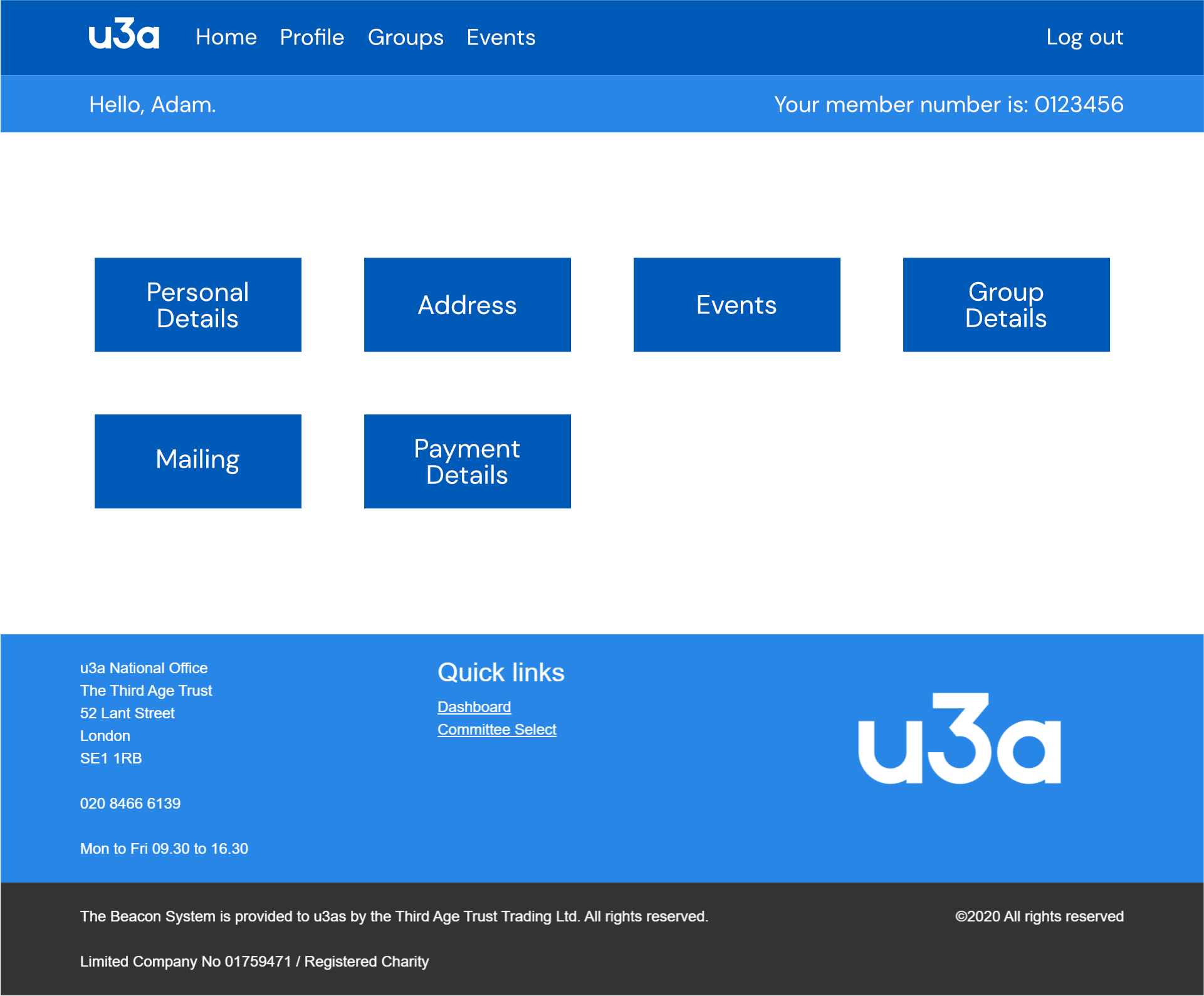
Mypage
HTML Examples
News item

Accordion
As part of meeting accessibility requirements for accordions, a keyboard focusable toggle all button should be present, or all elements should be individually focusable. Elements that are collapsed should be removed from the focus flow while collapsed.
Toggle Dropdown
Membership Details
Last renewed on 11/03/2020 via the member portal
Next renewal due 01/03/2021. Renew now
Joint member, partnered with Jane Smith (293302). View partner details
Gift aid declaration last made on 28/03/1999. View Gift Aid declaration
Toggle Dropdown
Contact Information
Last renewed on 11/03/2020 via the member portal
Next renewal due 01/03/2021. Renew now
Joint member, partnered with Jane Smith (293302). View partner details
Gift aid declaration last made on 28/03/1999. View Gift Aid declaration